THE BOOK COVER
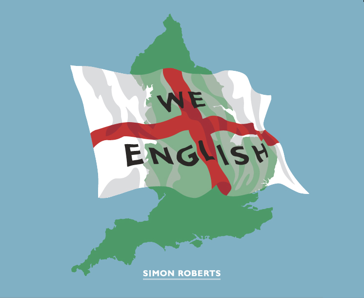
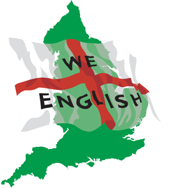
June 8th, 2009 adminWe English will be signed off this week and I’ll be heading to Verona at the end of the month to oversee the printing, along with the publisher Chris Boot. As I’ve mentioned before, the book is being designed by Damon Murray and Stephen Sorrell at Fuel, who we worked with on Motherland. Here’s a sneak preview of their fantastic design for the cover:


June 8th, 2009 at 11:26 am
Hello, now that this project is drawing to conclusion, what will happen to your blog? Will you start another for the next project and wind this one down? I’ve very much enjoyed following your process here, and wonder if you’ve found blogging your progress useful. Hope you don’t mind me asking…
cheers, Lucy
June 8th, 2009 at 1:28 pm
Hi Lucy
Thanks for your post and I’m glad to hear that you’ve found my meandering thoughts of interest.
Alas, the blog will be coming to an end soon!
While I’ve always seen this website as a kind of living archive – tracing its own trail of ideas, debates and questions alongside my photographs from the project – once the book is published in September, I intend bringing it to a close.
I’ve never thought of myself as a ‘blogger’, rather, my comments on this website were always intended to provide a context for this particularly body of work. A public justification for my thought process if you like.
It’s been a very enjoyable and rewarding experience, however, it’s also proved a huge amount of work. I now need to take a bit of time out to think about what comes next, and to see if I’ve got anything else worth talking about! Watch this space.
best
Simon
June 8th, 2009 at 3:45 pm
Simon, I’m interested to hear what the discussion was, if any, about using an illustration for the cover instead of a photograph from the project. That seems like a pretty significant and unusual decision for a photo book. Was it a contentious decision? Was it your idea or your publishers (or someone elses?) What do you think it says about the work inside or signals to someone who might not be familiar with you or the project?
June 9th, 2009 at 11:33 am
Hi Todd
Whether to use one photograph to represent the body of work on the cover versus using an illustration was certainly a difficult decision to make. In the end, we (the publisher and I) decided on the latter, mainly because we wanted to make a direct reference to the cover of my first monograph, Motherland (see it here- http://www.motherlandbook.com). Motherland was an exploration of, among other things, the Russians’ attachment to their homeland. We English is a development of this Russia work, springing from my fascination with ideas of belonging and memory, (national) identity and place. It therefore seemed fitting to make some kind of visual connection between the two books.
I find both cover designs (Motherland and We English) to be very contemporary and they certainly stand out, which is very important when you’re competing for buyers attention in a bookshop. I suppose there is a hope that the book also finds it’s way to a more prominent part of the bookshop, other than just the photography section – which is often at the back of the store in a far corner where few people venture!
I’m not sure if it’s that unusual as there does seem to be a recent trend for photography books not to have a photograph on the cover. Off the top of my head I can think of Larry Towel’s The World From My Front Porch, Michael Subotsky’s Beaufort West, Martin Parr’s Mexico, most publications by Stephen Gill and Paul Graham’s new book.
That’s not to say that my next won’t have a photograph!
June 9th, 2009 at 12:22 pm
Hello!
If I order a book through you would you sign it!?
Gutted that the blog is coming to an end, though I’m looking forward to what you do next.
Thanks for the reading and all the best!
Matt Clarke.
June 9th, 2009 at 11:07 pm
Really looking forward to getting hold of the book when it’s published. The cover looks great. Going with a design that references Motherland is a good decision.
July 15th, 2009 at 10:10 pm
[…] Simon about the background to this decision. He left a thoughtful response on his blog: I find both cover designs (Motherland and We English) to be very contemporary and they […]